 The coloring on this uploaded to be very wrong. It was a much darker and brighter blue, with the yellow a light and pure yellow (it seems to be tinted green on this website).
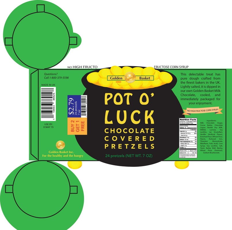 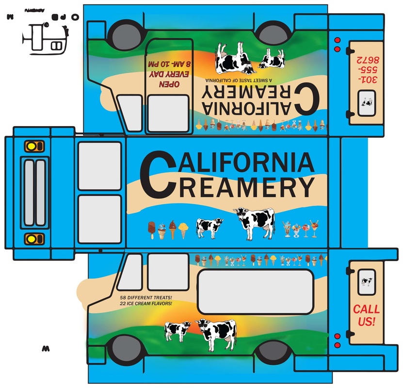 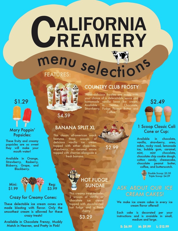 Here are some parts of my package design project. The first is a cylinder, and features the made up brand "Pot O' Luck". The second is a food truck design for another ice cream company I made up. The third is a menu for the for the food truck. While the colors may look different on here, they are actually made using the same color scheme on Illustrator (not sure why they are different).
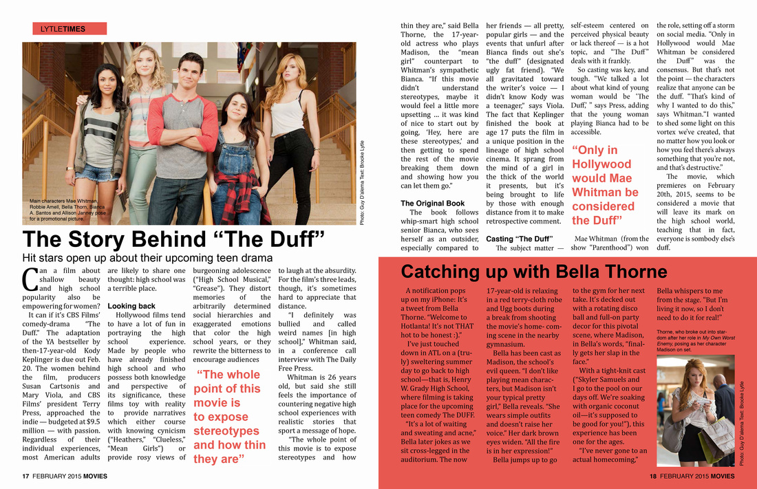
This is one version of the magazine spread we had to design. We could pick the subject, so I picked an upcoming movie "The Duff" that I really wanted to see. We had to create 3 different comps and then 3 different versions of one comp on the computer. This is the first one I designed. It had to have a drop shadow, pictures, quotes, a title, and pages numbers along with photo credits.
While my design is slightly generic, it was difficult to use a program I had only used twice before. I chose the color scheme of a reddish-pink as it will appeal to teenage girls (the movie appeals to that age group as well). I chose quotes that were interesting and would grab the reader's attention. I also chose a sub-section that pertains to the whole piece, but only a certain part of it. I chose Bella Thorne, who is the "mean girl" within the movie. While I didn't write the article, I made sure the sections made sense and flowed together. In other versions, the quotes are moved around and the color scheme is navy blue. 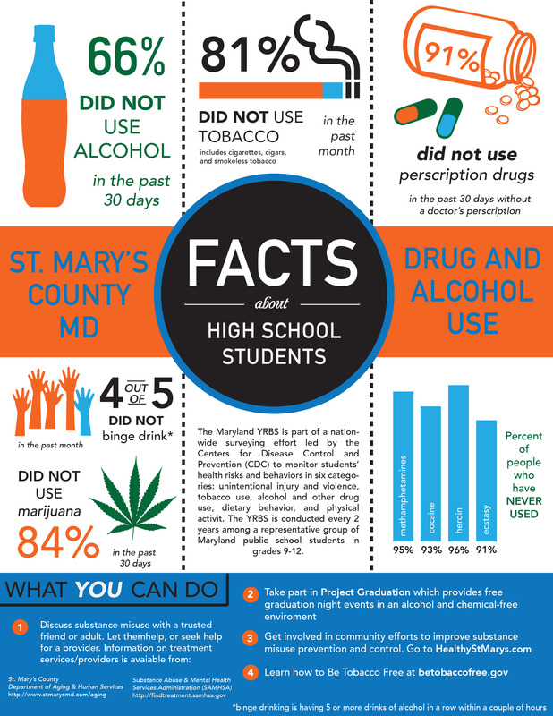 This was a project we had to do for the survey of drug facts in St. Mary's County. They surveyed all the students in the county and received the following data and asked us to put it into a design that was appealing to viewers. We had to create a black and white version and a color version. We had to include everything on the paper they gave us, including what you can do to prevent drug/alcohol use and how many people haven't used drugs.
I did my black and white version first. I originally wanted to do a banner idea, but used the circle and the rectangle to create my own type of "banner". This way the first thing people look at is the center: facts about high school students. The next thing they should look at are the words next to it. My favorite parts of this design where the drug bottle and the hands for binge drinking, since the idea seemed original and people could relate easily to the visuals. After black and white, I picked a orange/blue theme with a hint of green so there wasn't too much color. The green kept the color scheme from seeming too plain, while the minimal colors kept the design organized. 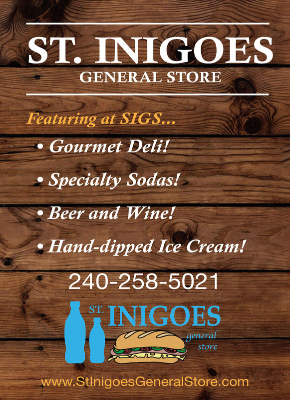 This poster was for a tavern sign for a store down in Southern Maryland who thought they should update their look. It had to be very minimal, since people would be driving by this and reading it. That means the words had to be big, easy to read, and intriguing. They wanted to include the fact that they had deli, sodas, beer and wine and hand-dipped ice cream.
I first began with a new logo. They mostly focus on the sodas and the deli, so I thought it would be good to incorporate those into the design. The first thing in the logo you see is the INIGOES, and then the sandwich, and then the sodas. This was on purpose, so you see what matters the most first. The wooden background is because of the fact that this is going on a tavern sign, so you would have to see what it looked like on wood. I used the colors blue, orange, and white to get the point across. 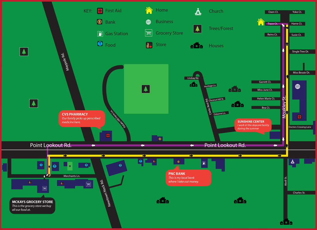 This is my wayfinding project. We were directed to create a wayfinding map from our house to the grocery store we go to. Luckily, mine was very close! We had to do two versions, a black and white version and a color version. I completed the black and white version first, but decided to show my color version. It had to show the path to the grocery store, have a key and symbols and small descriptions of items we had passed on the way to the store.
There are many colors in this design, but I attempted to keep the map realistic by having the background as green for grass, and the roads black. The buildings are navy so they stand out against the road, and the two paths are opposite colors so they stand out. The buildings were the hardest thing to make within this project. They are combinations of basic rectangles, and making them copy the real buildings can be very complicated. |
Piece of advice"If no one thinks you can, you have to." Archives
May 2015
Categories |
 RSS Feed
