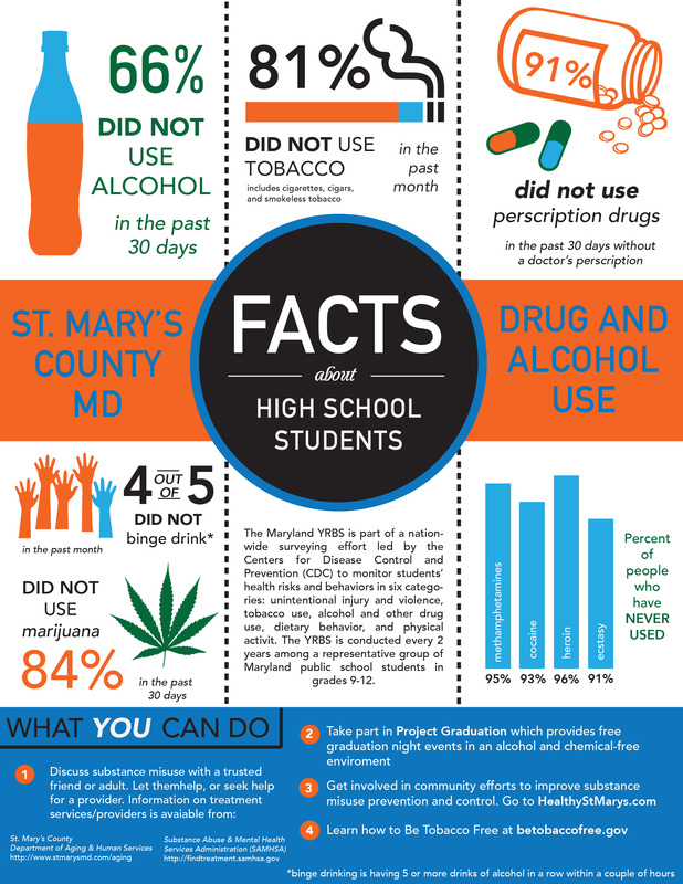
This was a project we had to do for the survey of drug facts in St. Mary's County. They surveyed all the students in the county and received the following data and asked us to put it into a design that was appealing to viewers. We had to create a black and white version and a color version. We had to include everything on the paper they gave us, including what you can do to prevent drug/alcohol use and how many people haven't used drugs.
I did my black and white version first. I originally wanted to do a banner idea, but used the circle and the rectangle to create my own type of "banner". This way the first thing people look at is the center: facts about high school students. The next thing they should look at are the words next to it. My favorite parts of this design where the drug bottle and the hands for binge drinking, since the idea seemed original and people could relate easily to the visuals. After black and white, I picked a orange/blue theme with a hint of green so there wasn't too much color. The green kept the color scheme from seeming too plain, while the minimal colors kept the design organized.
I did my black and white version first. I originally wanted to do a banner idea, but used the circle and the rectangle to create my own type of "banner". This way the first thing people look at is the center: facts about high school students. The next thing they should look at are the words next to it. My favorite parts of this design where the drug bottle and the hands for binge drinking, since the idea seemed original and people could relate easily to the visuals. After black and white, I picked a orange/blue theme with a hint of green so there wasn't too much color. The green kept the color scheme from seeming too plain, while the minimal colors kept the design organized.
 RSS Feed
